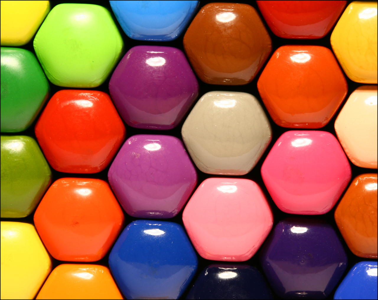
Do you feel anxious in a yellow room? Does the colour blue make you feel calm and relaxed? Artist/Interior designers have long understood how colour can dramatically affect moods, feelings and emotions. It is a powerful communication tool and can be used to signal action, influence mood and cause physiological reactions. Colour can also be deeply personal and often rooted in your own experience or culture.
We are faced with colour choices all the time. The first crucial decision of the day usually comes in the morning when deciding what to wear. Often times we will choose our clothes based on the colour of the mood we are feeling. Let’s just take it one step further – the colourist and designers decided what colour will be in fashion and what the fashonistas will be wearing for that season.
A little test was taken : An executive for a paint company received complaints from workers in a blue office that the office was too cold. When the offices were painted a warm peach – the sweaters came off even though the temperature had not changed.
Red is a very strong colour. It is a noticeable colour that is often used on caution and warning signs. It is often associated with stop or “beware”. It’s a hot colour that evokes a powerful emotion of passion, lust, sex, energy, blood and war. Red is a good colour to use for accents that need to take notice over other colours.
Orange is also a bright and warm colour. It represents fire, the sun, fun, warmth and tropical images. It is considered a fun light colour that has appetizing qualities to it. Orange increases oxygen supply to the brain and stimulates mental activity. It is highly accepted among young people. As a citrus colour, orange is associated with healthy food and stimulates appetite. Any design relating to the tropics, something fun, easy going and youthful should incorporate some type of orange into the design. A darker, richer shade of orange can be associated with autumn.
Yellow is the brightest colour to the human eye. It is an over-stimulating colour but also represents youth, fun, happiness, sunshine and other light playful feelings. It is a cheerful energetic colour. Yellow is often hard to read when placed on a white background so designers must be careful when using yellow. (Use this as an example)
Green is the colour of nature and health. It represents growth, nature, money, fertility and safety. Green is a relaxing colour that is easy on the eye and has a healing power to it. It is often used to represent anything having to do with health. Many pharmaceutical and nutritional companies use green in their logos and material to advertise safe natural products. Dark green is commonly associated with the military, money, finance, and banking. However it can also be associated with being new or inexperienced as being green.
Blue is a cool calming colour that shows creativity and intelligence. It is a popular colour among large corporations, hospitals and airlines. It is a colour of loyalty, strength, wisdom and trust. Blue has a calming effect on the psyche. Blue is a colour that generally looks good in almost any shade and is a popular color among males. Blue is not a good colour when used for food as there are few blue foods found in nature and it suppresses the appetite.
Purple combines the stability of blue and the energy of red. Throughout history purple has been associated with royalty, nobility and prestige. It symbolizes mystery, magic, power and luxury. Purple is often used to portray rich powerful kings, leaders, wizards and magicians. Purple combined with gold can be flashy and portray wealth and extravagance. Light purple and pink is good for a feminine design.
I think it’s incredible that without even realising – we are all affected by colour every single day! What’s your favourite colour??


